Strong Hero Image With CTA
Powerful, large and brand appropriate imagery is an amazing way to welcome users into the website - coupled with a clear call to action, users are immediately steered toward a high conversion user journey.
Founded in 1998, Sweaty Betty has been a pioneer in the activewear market for 25 years and has opened over 60 stores globally. Working with their London team in 2017 to transform their digital presence, their redesign and replatform to Salesforce saw a 40% increase in page speeds - alongside improved analytics to track performance into the future.

Founded in 1998, Sweaty Betty has been a pioneer in the activewear market for 25 years and has opened over 60 stores globally. Working with their London team in 2017 to transform their digital presence, their redesign and replatform to Salesforce saw a 40% increase in page speeds - alongside improved analytics to track performance into the future.


Powerful, large and brand appropriate imagery is an amazing way to welcome users into the website - coupled with a clear call to action, users are immediately steered toward a high conversion user journey.
Powerful, large and brand appropriate imagery is an amazing way to welcome users into the website - coupled with a clear call to action, users are immediately steered toward a high conversion user journey.
Responsive background video, instead of gifs, adds immeasurable depth to the page experience without compromising on load speeds.
Responsive background video, instead of gifs, adds immeasurable depth to the page experience without compromising on load speeds.
Sliders and carousel boost engagement and click through rates - as well as preventing content overload by managing the information hierarchy of the page.
Sliders and carousel boost engagement and click through rates - as well as preventing content overload by managing the information hierarchy of the page.

Responsive imagery means that the best possible image is served to the most suitable device, without compromising load times.
Responsive imagery means that the best possible image is served to the most suitable device, without compromising load times.
Rich video content needn't be relegated to desktop devices - background videos can be optimised to work well on mobile devices.
Rich video content needn't be relegated to desktop devices - background videos can be optimised to work well on mobile devices.
Content blocks here had to be designed and developed for non technical people. It's essential to find the right balance between a great responsive design and something easily edited by potential novices.
Content blocks here had to be designed and developed for non technical people. It's essential to find the right balance between a great responsive design and something easily edited by potential novices.

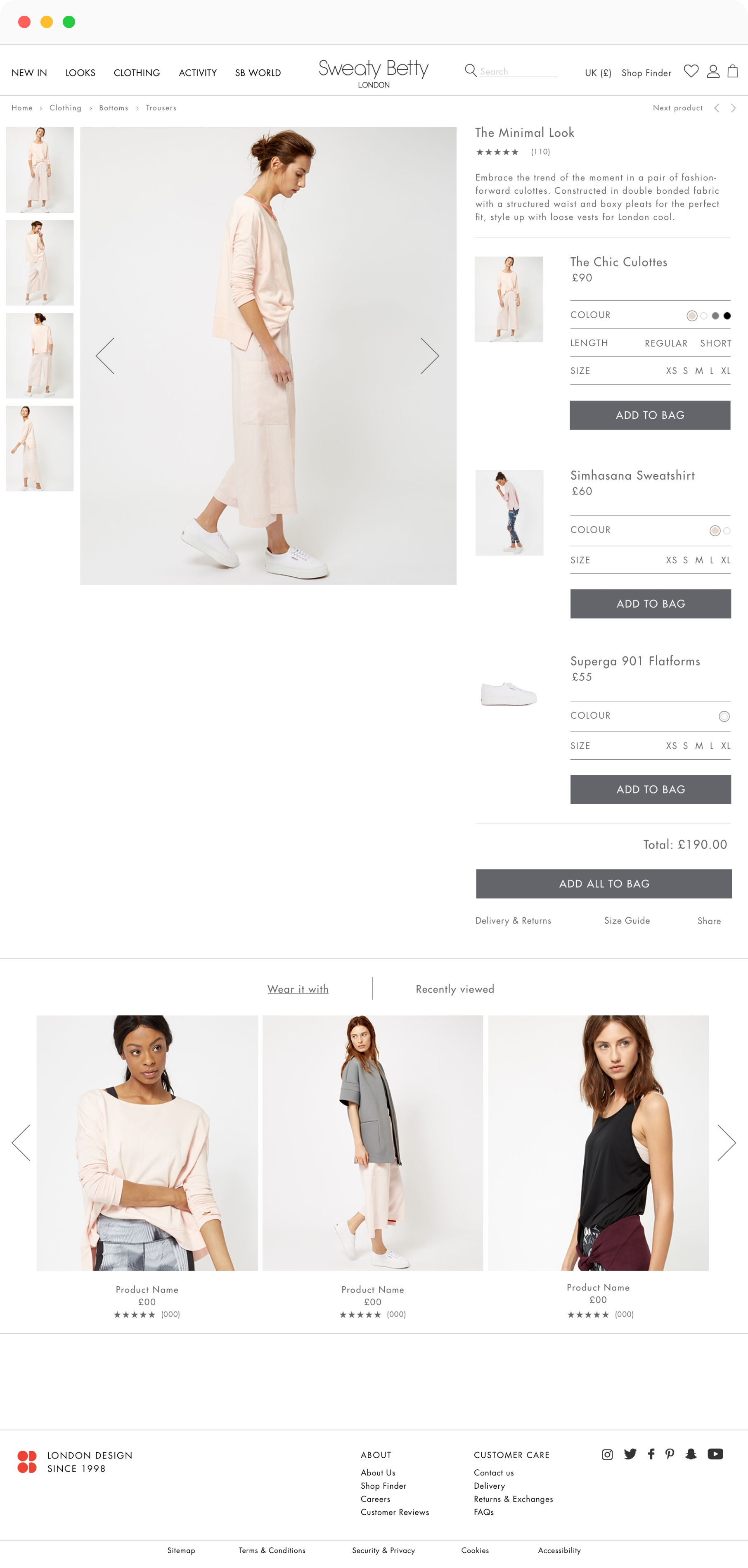
Large Detail Image
A large detail image is a proven way of growing conversion rates. There are also psychological ‘nudges’ too - for example, having the subject face the CTA is proven to increase click through rates
1
1.
Large Detail Image
A large detail image is a proven way of growing conversion rates. There are also psychological ‘nudges’ too - for example, having the subject face the CTA is proven to increase click through rates
Product Attributes
Colour swatches (as opposed to buttons or a dropdown) convert at higher rates. For this project, this was proven with A/B testing.
2
2.
Product Attributes
Colour swatches (as opposed to buttons or a dropdown) convert at higher rates. For this project, this was proven with A/B testing.
Product Thumbnails
On larger screen sizes, side thumbnails prevent the possibility of thumbnail images potentially appearing below the viewport. For mobile devices, the restricted real estate can necessitate thumbnails appearing below the fold.
3
3.
Product Thumbnails
On larger screen sizes, side thumbnails prevent the possibility of thumbnail images potentially appearing below the viewport. For mobile devices, the restricted real estate can necessitate thumbnails appearing below the fold.