Search Suggestions
Predictive Search helps customers find what they are looking for quickly and efficiently
RMW is an established footwear brand in Australia. They had a new set of brand guidelines and needed help translating those into a set of premium designs. Working remotely with them in Australia an on-brand set of designs were seamlessly integrated with their upcoming platform update.


Predictive Search helps customers find what they are looking for quickly and efficiently
Predictive Search helps customers find what they are looking for quickly and efficiently
Updating search results on keystroke as opposed to a page refresh customers can more seamlessly find what they are looking for
Updating search results on keystroke as opposed to a page refresh customers can more seamlessly find what they are looking for
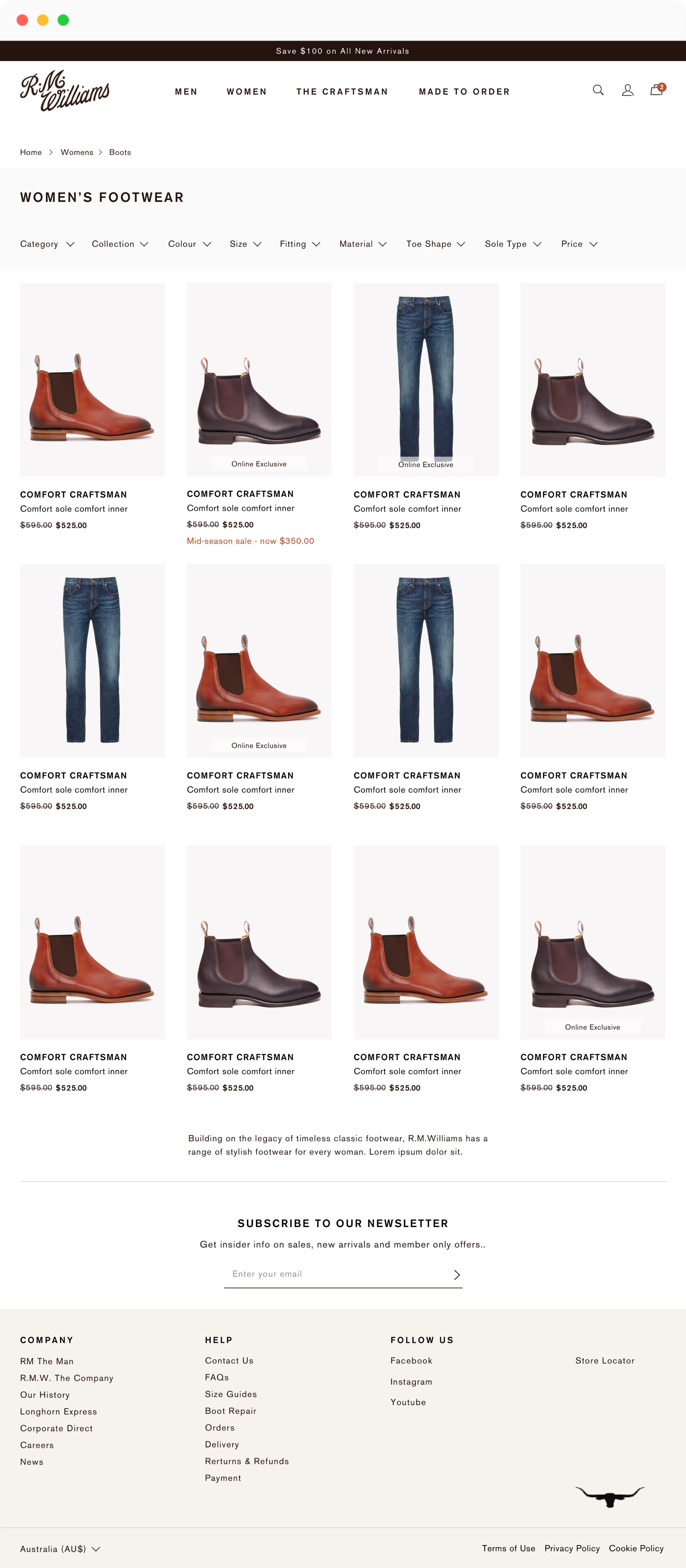
Two products per row allow for faster navigation and surfaces more products above the fold.
Two products per row allow for faster navigation and surfaces more products above the fold.


Horizontal filters, as opposed to a sidebar, allows for a higher proportion of screen real estate to be dedicated towards product imagery
Horizontal filters, as opposed to a sidebar, allows for a higher proportion of screen real estate to be dedicated towards product imagery
Having the option to show a model shot instead of a standard product image encourages greater engagement and click through rates
Having the option to show a model shot instead of a standard product image encourages greater engagement and click through rates

Product Imagery
At wider breakpoints the extra space is used to show multiple high quality images
1
1.
Product Imagery
At wider breakpoints the extra space is used to show multiple high quality images
Width Size Guide
A Size Guide popup is easily accessible to help inform users on this relatively complex / unheard of selection.
2
2.
Width Size Guide
A Size Guide popup is easily accessible to help inform users on this relatively complex / unheard of selection.
Size Selector
RMW sells shoes using 4 different standards. This tabbed dropdown approach addresses this added complexity by neatly organising sizes.
3
3.
Size Selector
RMW sells shoes using 4 different standards. This tabbed dropdown approach addresses this added complexity by neatly organising sizes.
Cross Selling
Sale messaging here encourages the purchase of complimentary products, increasing average order values.
4
4.
Cross Selling
Sale messaging here encourages the purchase of complimentary products, increasing average order values.
Brand Messaging
Editorial content helps reinforce brand messaging, reinforcing brand loyalty and customer retention.
5
5.
Brand Messaging
Editorial content helps reinforce brand messaging, reinforcing brand loyalty and customer retention.