Hierarchy
As this is a page about a specific artist, any particular choice of imagery in the hero is more generalised and less important. A smaller hero here draws the eye to the artist name and subnavigation below.
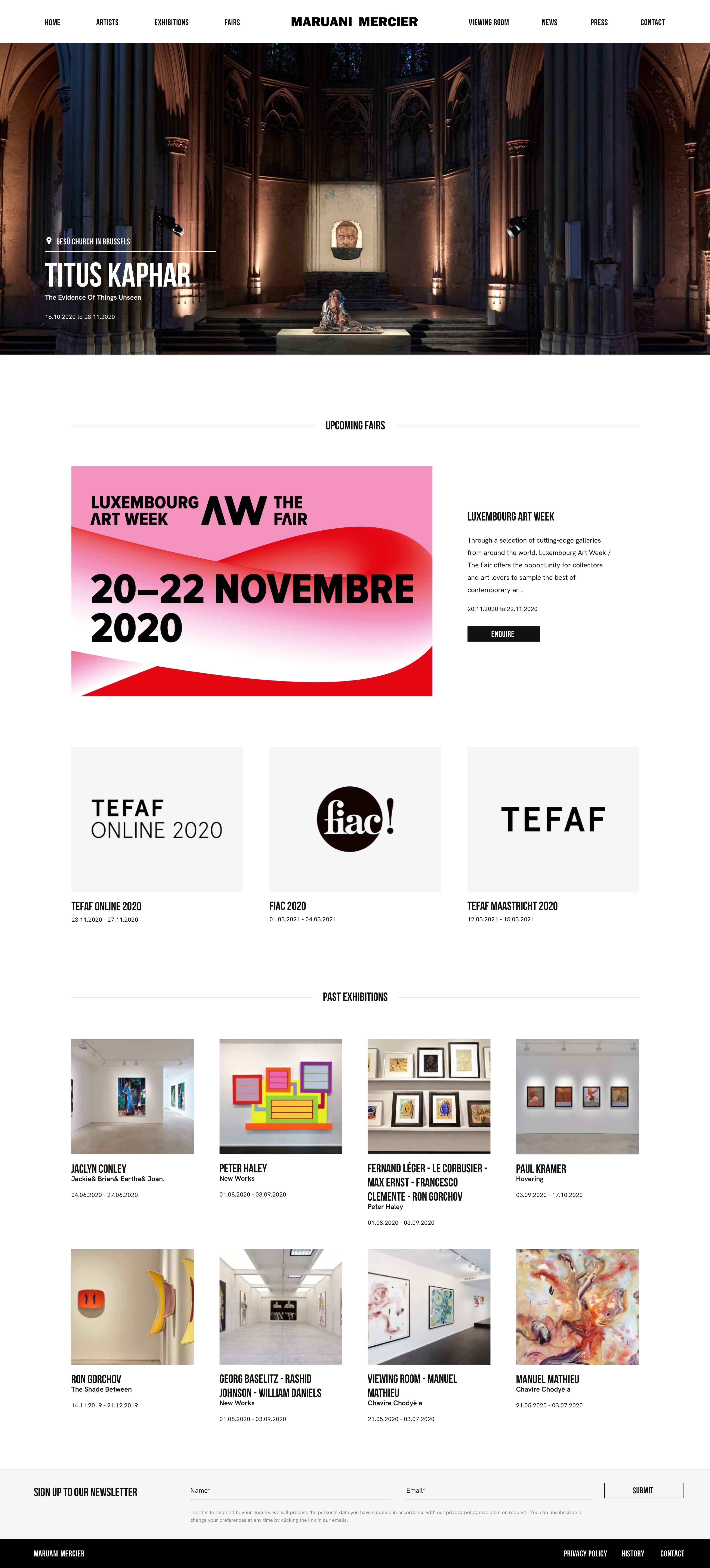
Maruani Mercier, a renowned gallery with multiple locations across Belgium wanted something bold and punchy for their new site. With bold type throughout, this site shrugs off the established styles of the artworld and embraces a confident, more modern approach to its digital presence.


As this is a page about a specific artist, any particular choice of imagery in the hero is more generalised and less important. A smaller hero here draws the eye to the artist name and subnavigation below.
Usually, galleries want their artwork grids to be captioned with things like the name, edition, prevelence etc.. But removing them as seen here provides a cleaner approach to highlighting to the artworks.
Placing exhibitions and news at the bottom of the page here encourages greater exploration of the site and prevents 'information cul-de-sacs'


Bebas Neue proves a contemporary, bold and clean embodiment of Maruani Merciers wider objectives with their new site.
Bebas Neue proves a contemporary, bold and clean embodiment of Maruani Merciers wider objectives with their new site.

Setting Boundaries
With this page in particular, end users are able to add content and media in a very fluid way. In terms of design, this means making sure edge cases are always considered as its borderline impossible to show designs for every combination of content.
1
1.
Setting Boundaries
With this page in particular, end users are able to add content and media in a very fluid way. In terms of design, this means making sure edge cases are always considered as its borderline impossible to show designs for every combination of content.
Different but the same
The grey background is not really seen elsewhere in the site. Whilst usually distinct visual elements are kept consistent sitewide, little flourishes here or there help keep things feeling fresh and interesting.
2
2.
Different but the same
The grey background is not really seen elsewhere in the site. Whilst usually distinct visual elements are kept consistent sitewide, little flourishes here or there help keep things feeling fresh and interesting.