Booking A Service
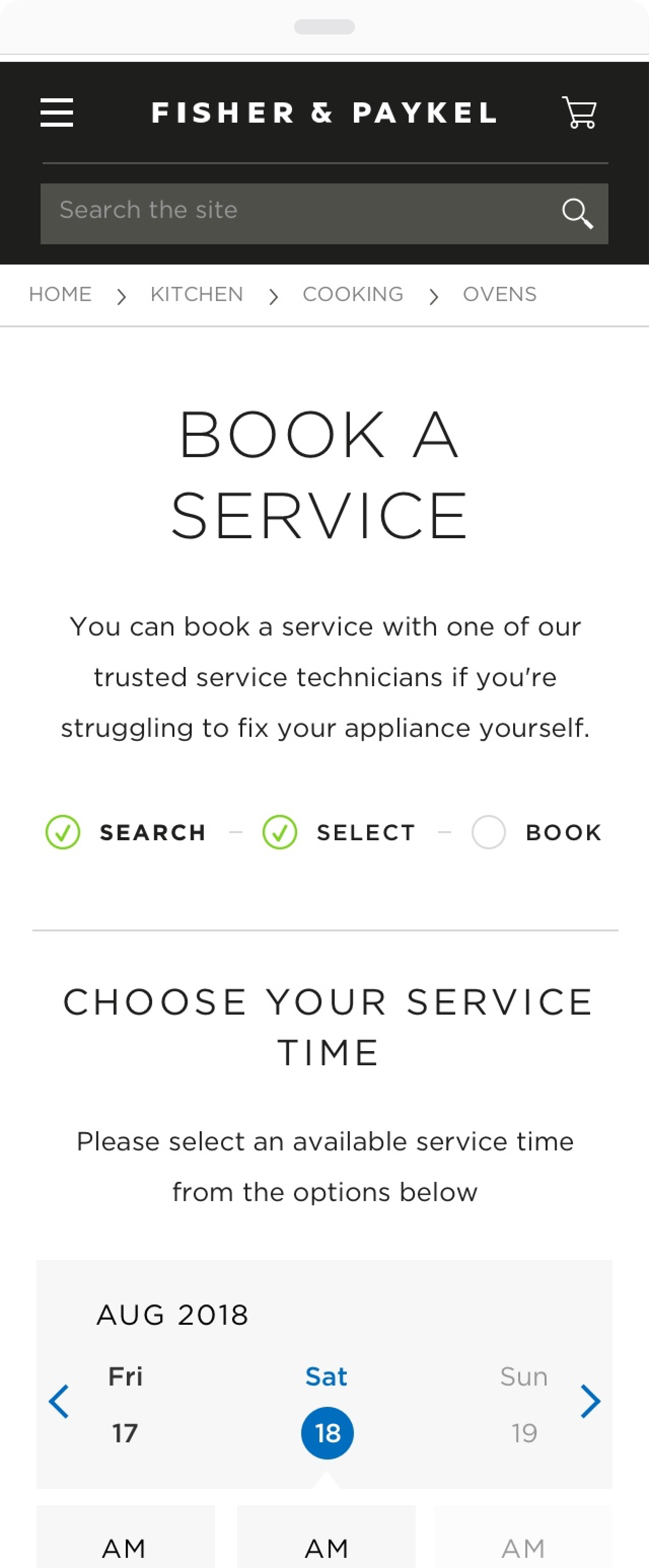
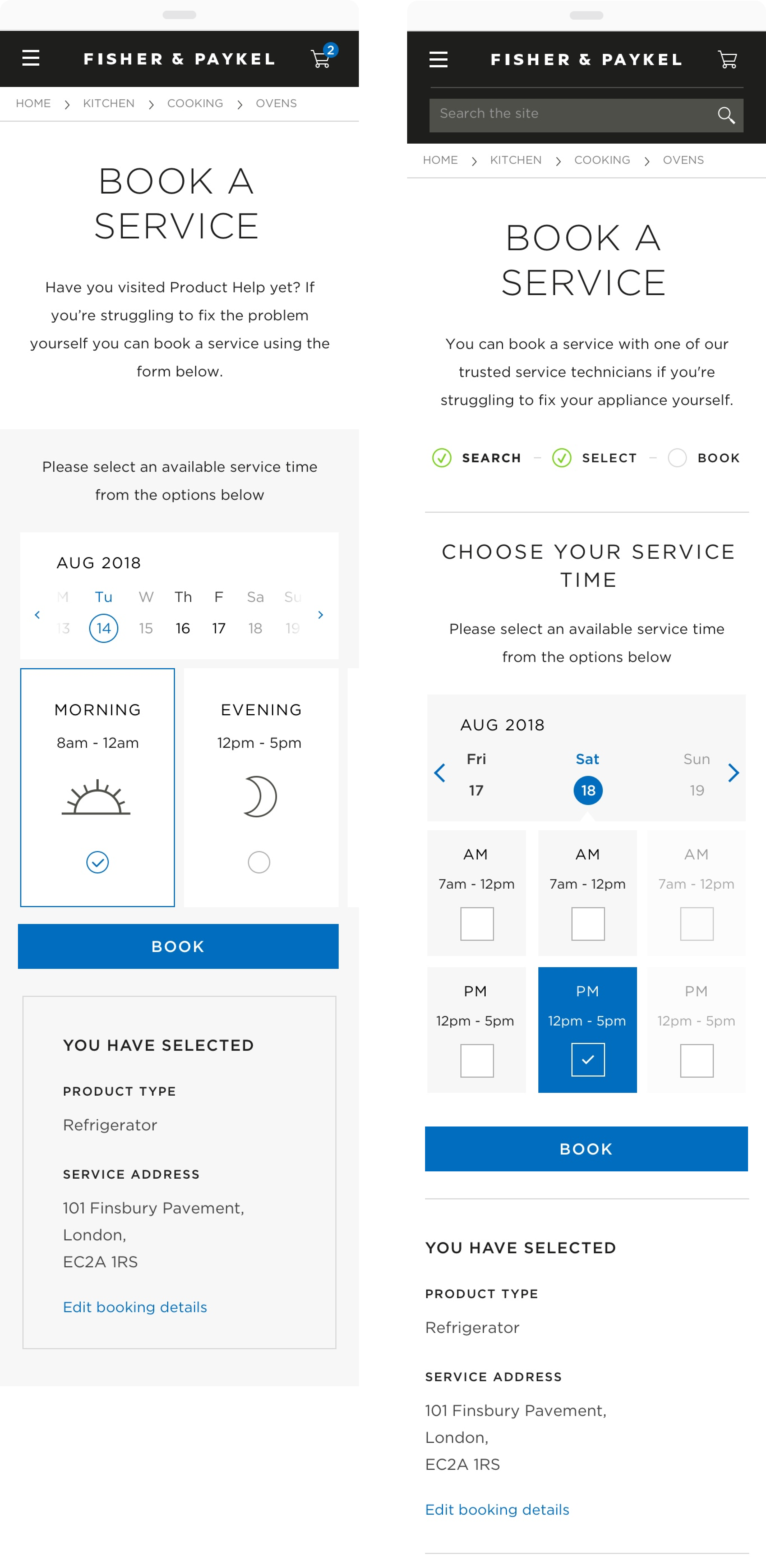
Fisher and Paykel wanted to redesign the experience for booking an engineer to service an appliance
Fisher and paykel is a household name since its New Zealand founding in 1934. It was a pleasure to work with a brand with such rich design heritage in the otherwise potentially bland world of Appliances. This was a particuarly wide reaching project, collaborating with teams all over the world to deliver their new digital experience.

Fisher and paykel is a household name since its New Zealand founding in 1934. It was a pleasure to work with a brand with such rich design heritage in the otherwise potentially bland world of Appliances. This was a particuarly wide reaching project, collaborating with teams all over the world to deliver their new digital experience.


Fisher and Paykel wanted to redesign the experience for booking an engineer to service an appliance
Fisher and Paykel wanted to redesign the experience for booking an engineer to service an appliance
The process of booking an appointment follows a similar flow to checkout - focussing on simple forms and data capture to prevent page abandonment
The process of booking an appointment follows a similar flow to checkout - focussing on simple forms and data capture to prevent page abandonment

It's crucial to offload non essential information away from the main flow in such a way as to not distract users. Lightboxes are used here to best manage the information hierarchy.
It's crucial to offload non essential information away from the main flow in such a way as to not distract users. Lightboxes are used here to best manage the information hierarchy.
Tables can be notoriously tricky to design for responsively while still getting across the information clearly. All options toward responsive tables are considered before deciding the best approach.
Tables can be notoriously tricky to design for responsively while still getting across the information clearly. All options toward responsive tables are considered before deciding the best approach.

As is best practice with Checkout journeys, the user is reassured of their progress using breadcrumbs
As is best practice with Checkout journeys, the user is reassured of their progress using breadcrumbs

Problems often have multiple design solutions - an iterative design process consisting of multiple rounds of feedback is essential
Problems often have multiple design solutions - an iterative design process consisting of multiple rounds of feedback is essential

SEO
Google friendly page headings allow for greater accessibility when entering this page straight via Google.
1
1.
SEO
Google friendly page headings allow for greater accessibility when entering this page straight via Google.
Product Set Overview
Having an overview here above the fold is a great way of managing information hierarchy on such a lengthy page
2
2.
Product Set Overview
Having an overview here above the fold is a great way of managing information hierarchy on such a lengthy page
Information Hierarchy
Offloading very technical information behind popups allow for a more streamlined experience
3
3.
Information Hierarchy
Offloading very technical information behind popups allow for a more streamlined experience