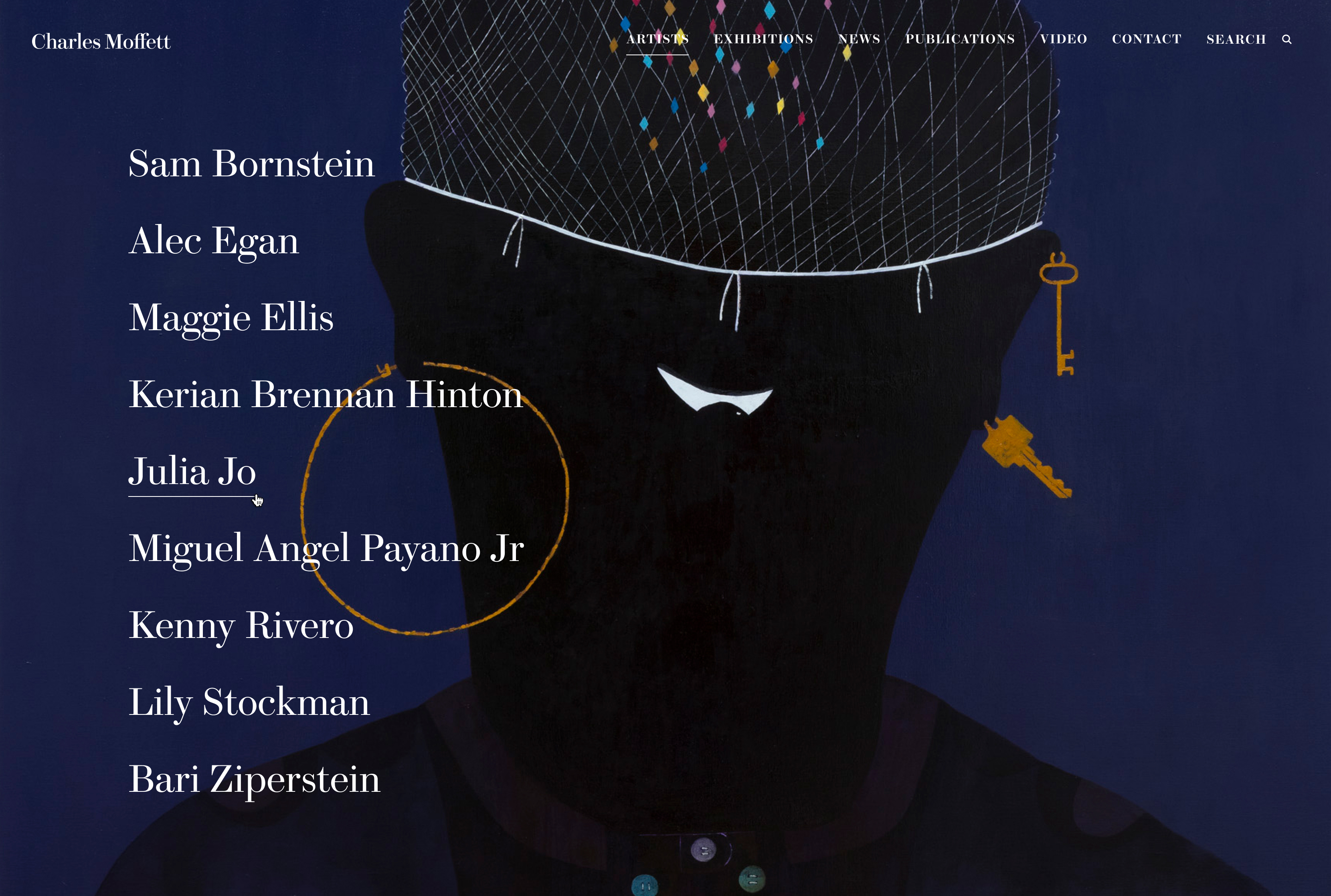
Simple Interactivity
Most galleries have a longer list of artists they wish to showcase, but Charles Moffett being a relative newcomer to the art world means we can shift focus away from artist names to their beautiful imagery.
Charles Moffett is a New York-based contemporary gallery showcasing works by both established and emerging artists. With this new site, Charles Moffett wanted to elevate their digital presence with a bold, elegant new site. Utilising a strong use of bold serif fonts and subtle animations, a beautiful new site was born.”


Most galleries have a longer list of artists they wish to showcase, but Charles Moffett being a relative newcomer to the art world means we can shift focus away from artist names to their beautiful imagery.


Mimicking the homepage hero, the artist name is proudly showed in the center of the image. The thinner weight of the font allowing for a large size without becoming too bulky.
This page is a great example of the offset motif shown throughout the site.
Restricting the grid here to 2 columns makes the most out of the detailed images being showcased.

Elegant Type
Taking inspiration from the physical space, which at the time was exhibiting works heavily inspired by floral patterns - an elegent serif display font sits front and center on the hero section.
1
1.
Elegant Type
Taking inspiration from the physical space, which at the time was exhibiting works heavily inspired by floral patterns - an elegent serif display font sits front and center on the hero section.
Make or Break the grid
Subverting expectation by offsetting items from the standard grid alignments makes for a more interesting content flow. It also provides a visual motif, easily applied to other elements creating visual cohesion with other pages.
2
2.
Make or Break the grid
Subverting expectation by offsetting items from the standard grid alignments makes for a more interesting content flow. It also provides a visual motif, easily applied to other elements creating visual cohesion with other pages.
Clear CTAs
One of Charles Moffett's main goals was to encourage engagement, and to drive users towards getting in touch with them. This simple, clean and bold contact form serves that purpose well here on the homepage.
3
3.
Clear CTAs
One of Charles Moffett's main goals was to encourage engagement, and to drive users towards getting in touch with them. This simple, clean and bold contact form serves that purpose well here on the homepage.